


Emotional design in real estate websites helps buyers feel more confident before they are ready to enquire. In real estate, decisions are rarely purely rational. People respond to atmosphere, trust, calm, aspiration, and the sense that a project fits the kind of life or investment future they want.
That matters because the website is often the first place where those impressions form. Research around UX and trust in property platforms continues to show that clarity, professionalism, and perceived authenticity shape user confidence significantly. Sources: Nilead on real estate website trust signals, Complitech on UX and trust in real estate platforms, MARKETIKA insight on emotional web design for real estate developers.
For developers, emotional design is not decoration. It is the deliberate use of digital experience to make the project feel clearer, safer, and more desirable.
What emotional design actually means
Emotional design is the use of interface choices to influence how the user feels while moving through the website. In a real estate context, that usually involves:
- warmer or calmer visual pacing
- more intentional imagery
- cleaner typography and hierarchy
- less friction in the user path
- reassurance at key decision moments
The point is not to manufacture emotion artificially. It is to support the emotional reality that already exists in high-stakes property decisions.
Why buyer confidence is emotional before it is analytical
People often think confidence comes after all the facts are gathered. In practice, confidence usually starts forming much earlier. Buyers decide whether a project feels credible before they finish reading the details.
That early feeling is shaped by:
- visual quality
- tone of voice
- interface calmness
- sense of order
- perceived care in presentation
If the website feels inconsistent or chaotic, the user may distrust the project before consciously articulating why.
Which design choices affect trust most
Visual coherence
When typography, imagery, spacing, and layout work together, the website feels more intentional. That intentionality becomes a proxy for professionalism.
Clarity of hierarchy
A buyer should understand where to look first, second, and third. Strong hierarchy reduces mental effort and helps the site feel more trustworthy.
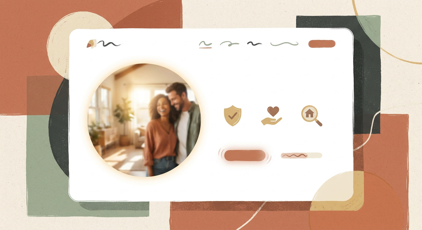
Appropriate emotional tone
A family-oriented development should feel different from a luxury urban residence. Emotional design should reflect the project, not follow a generic template.
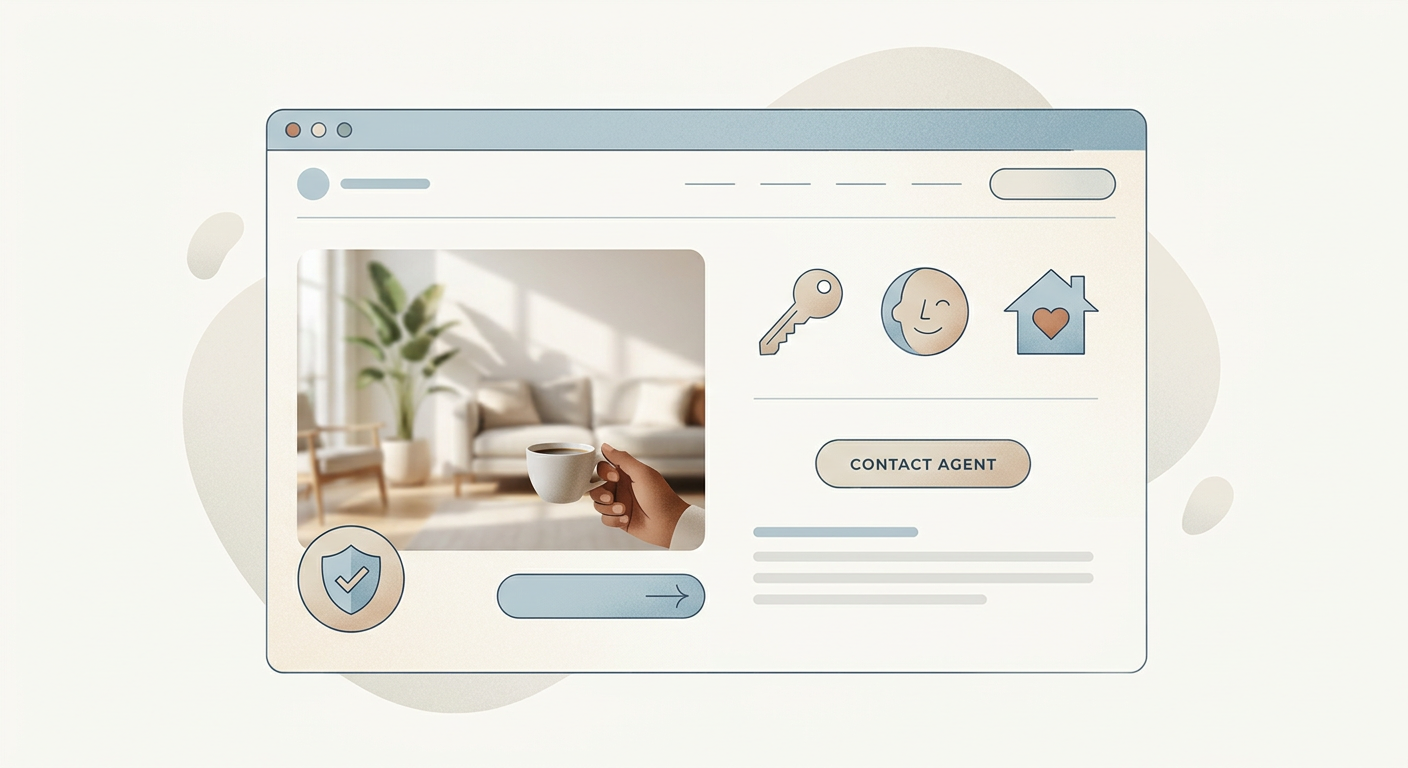
Reassurance at action points
The moment before a form or CTA is where emotional hesitation often peaks. Good UX reduces that tension.
Emotional design is not the same as visual polish
A site can look premium and still fail emotionally if it does not support the user’s underlying concerns. Emotional design only works when it is aligned with the buyer’s decision-making process.
That means the site should not only look elegant. It should also help the user:
- understand the offer quickly
- feel that the project is real and credible
- imagine themselves in the space or context
- move toward the next step without pressure
Without that deeper support, visual polish becomes surface-level.
Where emotional design matters most on a project website
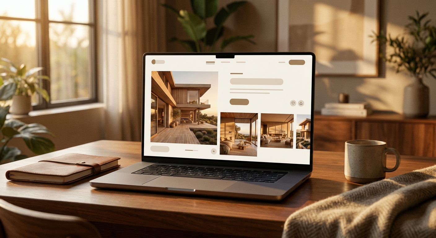
The first screen
The first screen sets emotional tone immediately. It should feel clear, premium, and stable rather than overloaded or sales-heavy.
Project storytelling sections
These sections shape aspiration. They help the user feel the lifestyle, location logic, or design intent behind the development.
Product and amenity explanation
Even practical sections can carry emotional weight when they reduce uncertainty and increase comfort.
CTA and enquiry flow
This is where reassurance becomes crucial. A calm and well-framed CTA usually performs better than one that feels abrupt or aggressive.
A practical emotional design framework for developers
A useful sequence looks like this:
- create calm first-screen orientation
- build aspiration through visuals and project framing
- reinforce trust through clarity and proof
- reduce friction near action steps
- keep emotional tone consistent throughout
This framework helps the site feel more like a guided experience and less like a collection of disconnected sections.
Common mistakes developers should avoid
Overusing mood without enough clarity
Atmosphere helps, but buyers still need real understanding.
Copying generic luxury aesthetics
If the tone does not match the project, emotional design feels performative rather than credible.
Making forms feel transactional too early
If the website becomes too mechanical right before the enquiry step, the emotional continuity breaks.
Ignoring the emotional role of micro-decisions
Spacing, button tone, section order, and image selection all contribute to confidence more than teams sometimes realize.
How this looks in practice
A well-designed digital environment such as Quatrimmo Vision shows how atmosphere and structure can work together. Similarly, MARKETIKA’s project portfolio illustrates why emotional direction becomes stronger when it is connected to UX and brand logic rather than applied as a visual layer afterward.
FAQ
What is emotional design in a real estate website?
It is the use of layout, imagery, tone, and interaction design to create stronger trust, aspiration, and comfort during the buyer journey.
Does emotional design help conversion?
It often helps indirectly and directly by making the project feel clearer, more credible, and easier to act on.
Is emotional design only relevant for luxury projects?
No. It matters across project categories, though the emotional tone should always match the project type and audience.
How can MARKETIKA help?
MARKETIKA can connect emotional direction, UX clarity, website structure, and project storytelling into digital experiences that feel premium and commercially effective at the same time.
Final takeaway
Emotional design in real estate websites builds buyer confidence because confidence starts with feeling as much as with analysis. Developers who shape that feeling thoughtfully make the project easier to trust and easier to remember.
When design supports reassurance instead of only appearance, the website becomes a more persuasive sales environment.


