


A high-converting real estate project website helps buyers understand the project, trust the developer, and take the next step with less friction. The best ones do not behave like digital brochures. They work like sales environments, guiding visitors from curiosity to confidence through story, structure, visuals, and lead capture.
That matters because project discovery is already digital. According to the National Association of REALTORS, 43% of buyers began their home search by looking online for properties for sale, and separate 2025 home buyer findings show that 52% found the home they purchased through the internet. At the same time, Adobe reports that 78% of consumers expect digital and physical brand experiences to feel consistent, while Salesforce continues to highlight how disconnected tools and data silos weaken sales performance. Sources: NAR 2025 home search behavior, 2025 buyer findings summary, Adobe AI and Digital Trends in Customer Engagement, Salesforce State of Sales 2026.
For developers, the implication is clear. Your website is often the first serious sales interaction the market has with a project. If it feels vague, cluttered, or disconnected from the wider sales system, conversion weakens. If it feels focused, premium, and easy to navigate, lead quality usually improves.
Why project websites matter more for developers than standard real estate websites
A project website is not the same thing as a property listing page. A listing page presents inventory. A project website has to establish trust in the developer, communicate a broader narrative, explain the offer clearly, and support a more complex decision-making process.
That is especially true for:
- pre-construction launches
- presale launches in markets where that language is standard
- off-plan launches in markets where that terminology is natural
- luxury or design-led projects
- multi-phase communities
- investor-oriented developments
- branded or destination-led residences
In these categories, buyers are not evaluating only bedrooms, bathrooms, and location. They are evaluating promise, credibility, design logic, lifestyle fit, and perceived value. That means the website needs to do more than display information. It needs to help the visitor decide that the project deserves attention.
What a high-converting real estate project website should include
The strongest developer websites usually share the same core architecture.
1. A sharp hero section
The first screen should answer the essentials quickly:
- what the project is
- who it is for
- why it is distinctive
- what the visitor should do next
A weak hero section forces the rest of the page to work too hard. A strong one builds immediate orientation and trust.
2. A clear project story
The website should not read like a pile of features. It should unfold a clear narrative about place, architecture, lifestyle, investment logic, or community value. This is where brand positioning matters. If the strategic message is weak, the website tends to sound generic.
That is why MARKETIKA’s real estate developer branding blueprint is such an important reference. Positioning makes website structure stronger.
3. Product clarity
Buyers should be able to understand the actual offer without hunting for it. That includes:
- unit mix or property types
- floorplans and layout logic
- amenities
- project phases if relevant
- delivery timing where appropriate
- any practical detail that reduces uncertainty
4. Location explained in context
Location should not be reduced to a map pin. The website should explain why the location matters, whether that means lifestyle access, destination prestige, future growth, commute logic, waterfront value, or neighborhood convenience.
5. Trust signals
A developer website needs proof. That may include:
- developer track record
- project visuals with a consistent quality level
- construction credibility
- clearer explanation of brand promise
- stronger digital consistency across all touchpoints
6. Lead capture and CTA hierarchy
Visitors should not need to guess what to do next. Good project websites usually provide several natural pathways, such as:
- request pricing
- download brochure
- book a presentation
- schedule a site visit
- speak with sales
The right CTA depends on the stage of intent, but the structure should always feel intentional.
Brochure-style website versus conversion-focused website
How mobile UX affects lead quality
Mobile performance is not just a technical concern. It affects the quality of the sales journey.
If a project website is slow, overly animated, awkward to navigate, or difficult to read on a phone, many visitors leave before they ever understand the value. In practice, that means the marketing team may still buy traffic, but weaker UX filters out confidence before the visitor becomes a qualified lead.
High-performing mobile experience usually means:
- fast perceived load time
- simpler navigation
- concise but informative sectioning
- CTAs that are easy to reach
- forms that do not create unnecessary effort
- visuals that remain premium without becoming heavy
This matters even more for international buyers and investors, who often discover and compare projects remotely.
Which website elements improve buyer confidence most
A project website improves buyer confidence when each section is self-contained, useful, and easy to scan.
Clear section hierarchy
Visitors should understand the structure of the page almost instantly. That means strong H2 and H3 logic, consistent spacing, and sections built around one idea at a time.
Premium but purposeful visuals
CGI, photography, and editorial design should do more than decorate. They should help the visitor understand the project’s promise. For reference, MARKETIKA’s real estate project portfolio shows how premium visuals and digital structure can reinforce one another.
Floorplans and product tools
Layouts, selectors, and plan views create confidence because they reduce abstraction. The more expensive or pre-construction the product is, the more this matters.
Simple explanatory frameworks
Some projects benefit from a framework block, comparison module, or checklist that helps visitors process information faster. These are especially useful for AI-search-friendly structure too, because they make sections easier to extract and synthesize.
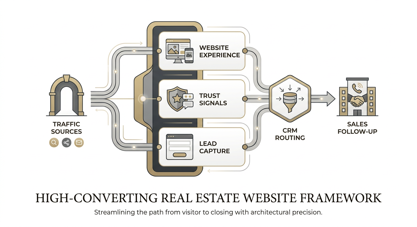
CRM-connected enquiry flow
A website becomes much more valuable when its enquiry system is tied to routing, source tracking, and follow-up. This logic is strongest when the website, CRM setup, and sales workflow are planned as one connected system rather than separate deliverables. MARKETIKA’s expertise and project portfolio both reflect that integrated approach.
Common mistakes that weaken real estate website conversion
Weak first-screen messaging
If the first screen looks elegant but does not explain the value, the visitor keeps more unanswered questions than necessary.
Too much generic copy
Words like luxury, exclusive, elevated, and premium lose value when they are not tied to something specific.
Visual quality without structural clarity
Beautiful visuals help. But if the page structure is confusing, the user still hesitates.
No distinction between audiences
An investor, end user, broker, and lifestyle buyer often need different signals. The website does not need to become fragmented, but it should at least acknowledge different priorities.
Friction-heavy conversion paths
A project website should never make the user feel like they are being asked for too much information too early.
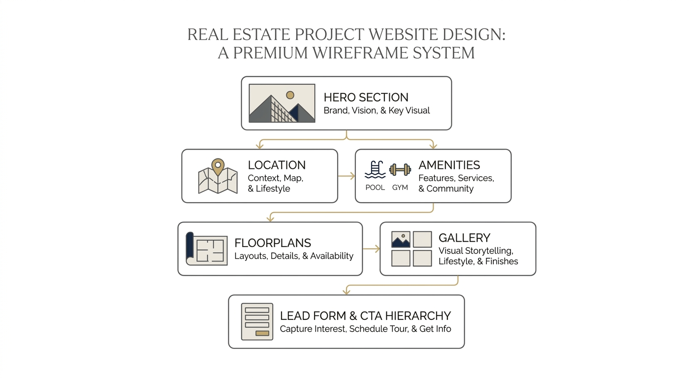
A practical structure developers can follow
A useful sequence for most project websites looks like this:
- Hero section with project positioning and CTA
- Short brand or developer credibility layer
- Project story and key differentiators
- Location context and destination logic
- Product clarity, including layouts, types, and features
- Amenities and lifestyle depth
- Gallery or premium visual storytelling layer
- Trust signals and proof
- Lead capture moments with clear next steps
This structure can flex, but the principle stays the same: explain the project in the order a buyer naturally builds confidence.
How this looks in practice
A useful reference is Velos Residence, where premium visual direction, architectural presentation, and project narrative support the digital experience more effectively than a generic launch page would. Similarly, Quatrimmo Vision is helpful as an example of how story and web experience can feel more deliberate when the project is given a distinct digital environment.
The common lesson is that stronger websites do not simply add more sections. They create more coherence.
FAQ
What should a real estate project website include?
It should include a clear hero section, project story, product details, location explanation, trust signals, strong visuals, and clear CTA pathways. The strongest sites also connect to CRM and sales workflows.
How long does it take to build a strong project website?
That depends on project complexity, brand readiness, and the level of visual or interactive production required. In most cases, the highest-performing sites are planned strategically rather than assembled quickly from templates.
Should a project website connect to CRM?
Yes. A website that captures leads without clear routing, tagging, and follow-up logic leaves too much value on the table.
What improves conversion the most?
Usually the biggest gains come from clearer positioning, stronger first-screen messaging, better product explanation, lower mobile friction, and more intentional CTA hierarchy.
Final takeaway
A high-converting real estate project website does not win because it looks expensive. It wins because it reduces friction, builds trust, and helps the visitor understand why the project deserves a closer look.
For developers, the website is one of the highest-leverage parts of the launch system. When brand strategy, product clarity, visuals, and lead capture all work together, the website stops being a brochure and starts acting like a serious sales asset.


