


Minimalist real estate website design works when it removes friction without removing meaning. For developers, that balance matters. A sparse website that feels elegant but says very little will not convert. But a clean website that helps buyers understand the project quickly can outperform a cluttered experience that tries to say everything at once.
That matters because digital-first evaluation is now standard. The National Association of REALTORS reports that 43% of buyers began their home search online, while separate 2025 findings show that 52% found the home they purchased through the internet. In practice, that means many buyers and investors form their first serious opinion of a project through a screen, not a showroom. Sources: NAR 2025 home search behavior, 2025 buyer findings summary.
For developers, minimalism is not about style for style’s sake. It is about clarity, confidence, and better decision-making.
What minimalist design actually means in a developer context
Minimalist web design is often misunderstood as visual emptiness. In a strong project website, it means reducing noise so the most important information becomes easier to absorb.
That usually includes:
- fewer but better-composed sections
- clearer visual hierarchy
- stronger spacing and readability
- less decorative clutter
- more disciplined calls to action
The real goal is not to look modern. It is to guide the visitor from first impression to next step with less hesitation.
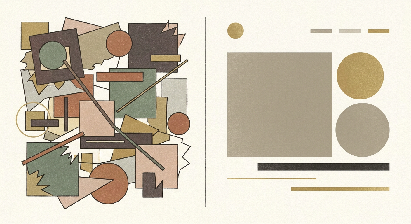
Why clarity often converts better than clutter
When a project website tries to present too many messages at once, trust tends to weaken rather than grow. Buyers may see more content, but they understand less.
A clearer interface helps because it:
- reduces cognitive overload
- makes the offer easier to scan
- highlights what matters most
- creates a stronger premium feel
- lets imagery and architecture do more of the persuasion
This is especially important in real estate, where the product is already complex. The website should reduce ambiguity, not add more of it.
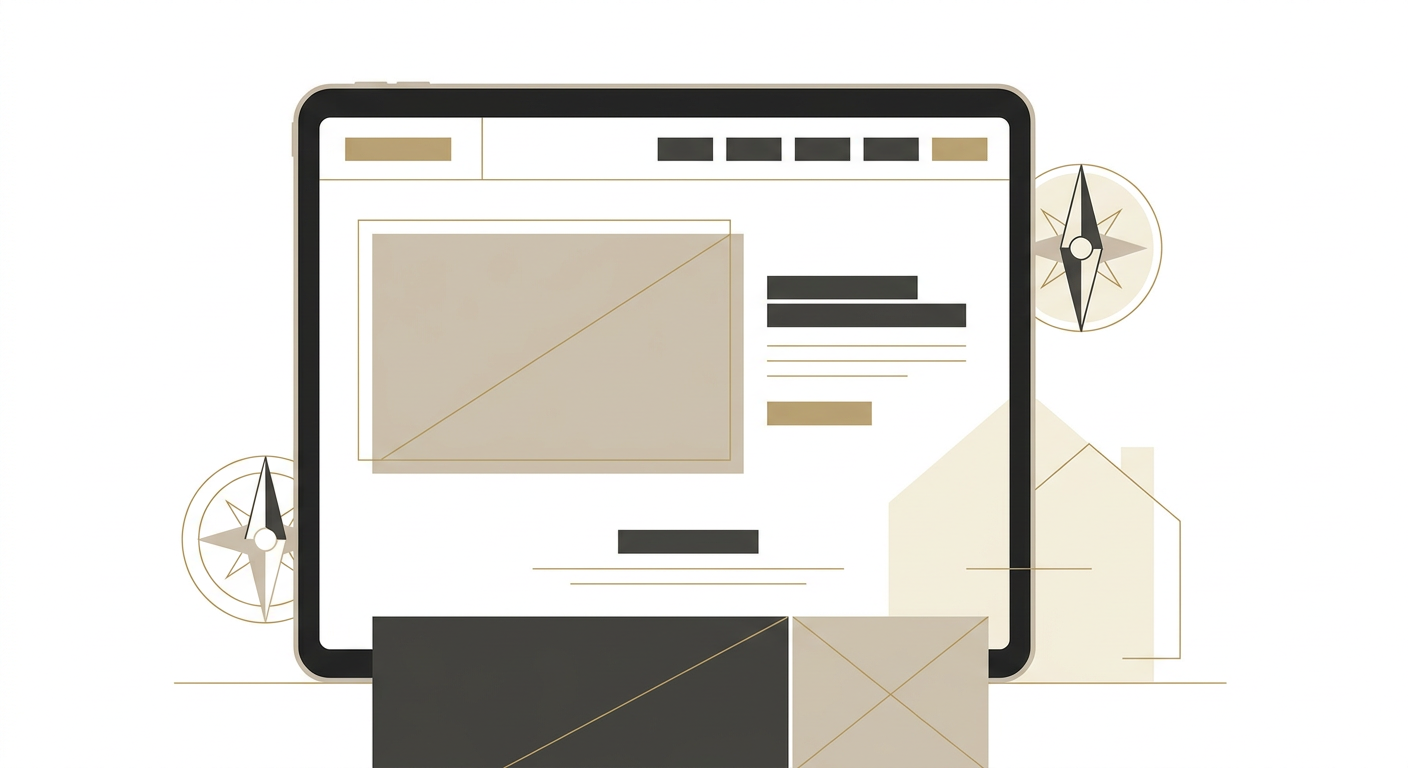
Where minimalist design helps most on developer websites
In the first screen
A minimalist hero section can work extremely well when it answers the essentials quickly:
- what the project is
- where it is
- why it matters
- what the next step should be
Too many sliders, badges, overlays, and competing messages usually weaken that first impression.
In page structure
Minimalist structure helps users process one idea at a time. Instead of overwhelming the visitor with every feature at once, it creates a sequence: project promise, location logic, product clarity, trust signals, then enquiry.
In lead capture
Minimalism is especially effective around forms and CTAs. When the user sees fewer distractions, the intended action becomes easier to take.
Minimalism does not mean thin content
This is where many brands get it wrong. A minimalist interface still needs substance beneath it.
A project website can look calm and premium while still including:
- clear product explanations
- floorplans or layout summaries
- location context
- trust signals
- well-placed CTA options
The difference is that each element has to earn its place. A minimalist page removes filler, not value.
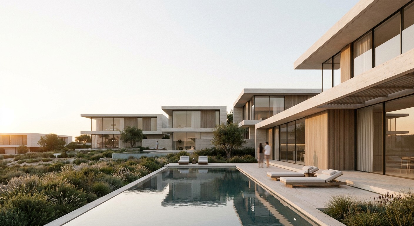
What makes a minimalist real estate site feel premium
For developers, premium minimalism usually depends on discipline more than decoration.
That often means:
- fewer fonts and tighter type hierarchy
- restrained color use
- stronger image selection
- intentional pacing between sections
- elegant but functional motion
- copy that is specific instead of generic
This is one reason public references such as Almal Investments and Quatrimmo Vision are useful. Cleaner digital environments tend to make the project feel more deliberate, not less informative.
When minimalist design is the wrong choice
Minimalism becomes a problem when it turns into under-explanation.
That usually happens when:
- key project details are hidden or missing
- navigation becomes too abstract
- imagery is doing all the work without enough context
- the page feels elegant but commercially vague
A developer website should never force the visitor to guess what is being offered.
A practical minimalist framework developers can use
A useful sequence for minimalist project websites often looks like this:
- Clear hero with one main message and one main action
- Short project story or value layer
- Product and lifestyle explanation in focused blocks
- One clean conversion step at a time
- Supporting trust signals without visual noise
The point is not to reduce the amount of thinking. It is to make the thinking easier for the user.
Common mistakes to avoid
Confusing minimalism with emptiness
A sparse page with weak content is not strategic minimalism. It is unfinished communication.
Using vague luxury language
Minimalist sites depend on precision. Generic premium wording weakens the effect.
Hiding practical details
Clarity in product, location, and next steps still matters.
Over-designing simple interactions
Too much animation or experimental UI usually works against the calm, confident feel minimalism is supposed to create.
FAQ
Does minimalist website design improve conversion?
It can, when it improves clarity and reduces distraction. The biggest gains usually come from better hierarchy and stronger user focus rather than visual simplicity alone.
Is minimalist design right for every project?
Not always. It works best when the project story is strong and the key information can be presented clearly without overloading the page.
Can a minimalist website still feel premium?
Yes. In fact, premium real estate websites often benefit from restraint because it lets architecture, imagery, and positioning feel more intentional.
How can MARKETIKA help?
MARKETIKA can connect brand strategy, visual direction, website UX, and conversion thinking into digital experiences that feel premium without becoming cluttered.
Final takeaway
Minimalist real estate website design works when it makes the project easier to understand, easier to trust, and easier to act on. For developers, that means clarity should be treated as a conversion tool, not just a design preference.
When the interface is calm, focused, and commercially intelligent, the project feels stronger before sales even begin.


