


Real estate landing page optimization matters because paid campaigns are only as strong as the page they send traffic to. Developers can buy attention with ads, but they still need the landing experience to build trust, explain the project, and capture intent.
That matters even more in a competitive digital environment. Industry benchmark data compiled by Colorlib places median landing page conversion rates around 3.6%, with top-performing pages reaching much higher. At the same time, buyer research behavior remains heavily digital, with the National Association of REALTORS reporting that 43% of buyers began their home search online. Sources: Landing page statistics and benchmarks, NAR 2025 home search behavior.
For developers, the implication is straightforward. If the landing page is unclear, cluttered, or disconnected from the ad promise, conversion weakens before sales ever has a chance to qualify the lead.
What a landing page should do for developers
A real estate landing page is not meant to behave like a full corporate website. Its role is narrower and more commercial. It should help one audience take one next step around one specific offer.
That offer might be:
- register interest in a new development
- request pricing
- download a brochure
- book a presentation
- ask for investor information
The strongest landing pages reduce distraction and match the campaign intent closely.
Why landing pages underperform
Developers often lose conversion for predictable reasons:
- the ad promise and the landing message do not match
- the page asks for too much too early
- the visitor cannot understand the project fast enough
- the CTA is too weak or too vague
- there are not enough trust signals near the form
These are not only design issues. They are conversion logic issues.
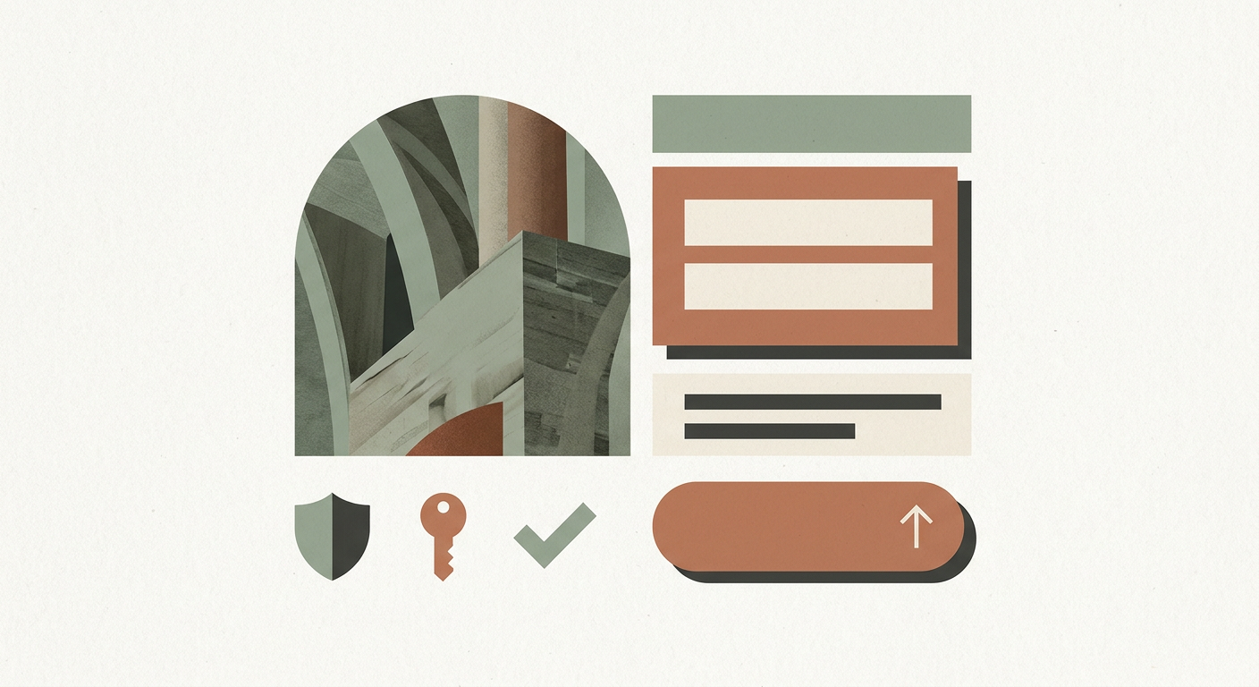
The core elements of a high-converting real estate landing page
A strong first-screen message
The first screen should clarify the project and the offer immediately. The visitor should not have to infer what they are looking at.
One main CTA path
Multiple weak options create hesitation. One strong path, supported by one or two secondary actions at most, usually performs better.
A concise form strategy
Shorter forms often help increase response volume, but the right number of fields depends on the lead quality required. The key is to ask only for what the next step actually needs.
Trust signals close to action points
Testimonials, proof of developer credibility, premium visuals, or other forms of reassurance should sit near the CTA rather than far away.
Message continuity
If the campaign promises one thing and the page looks or sounds different, the user feels friction immediately.
How to improve conversion without making the page feel aggressive
The best real estate landing pages do not feel like direct-response templates copied from another industry. They still need a premium tone.
That usually means:
- clearer hierarchy instead of louder design
- fewer sections but stronger sequencing
- better visual proof rather than more claims
- natural CTA language such as request pricing or book a presentation
- calmer form design with less clutter
Premium conversion is not about shouting harder. It is about making confidence easier.
Which sections usually help the most
For most developer landing pages, the strongest section sequence looks like this:
- Hero with project message and CTA
- Short differentiator block
- Visual or product explanation
- Trust signals or developer credibility
- Supporting CTA
- FAQ or final reassurance block
This sequence can vary, but the principle remains the same: answer the visitor’s biggest questions in the order they naturally arise.
Why message match is so important
One of the simplest ways to improve conversion is to make the ad and the landing page feel like the same conversation.
If a user clicks on messaging about waterfront living, investment potential, or a limited launch release, the landing page should continue that exact theme rather than switch into generic project language.
That continuity helps preserve intent. Without it, the user has to re-orient, which is where drop-off starts.
How forms should be handled
Forms are often where developers either win or lose the lead.
A strong form approach usually includes:
- a clear headline above the form
- only the most necessary fields
- reassurance on what happens next
- optional qualification only if commercially useful
- strong follow-up logic after submission
The form is not just a collection box. It is part of the conversion experience.

What to test first
Developers do not need endless experimentation. A few focused tests can go a long way.
Start with:
- headline clarity
- CTA wording
- form length
- order of proof elements
- image or hero treatment
- mobile form usability
This is where disciplined optimization matters more than constant redesign.
Common mistakes developers should avoid
Sending paid traffic to a generic project page
A dedicated landing page usually performs better because it is built around one action.
Overloading the page
More copy, more visuals, and more modules do not automatically create more trust.
Using weak CTA language
General phrases often underperform compared with clear, action-oriented language.
Ignoring mobile friction
If the landing page is difficult to use on mobile, a large share of paid traffic may be wasted.
How this connects to the wider website
Landing pages work best when they are not disconnected from the wider launch system. The page still needs to feel consistent with the developer brand, website tone, and follow-up process.
That is why a more integrated digital approach, such as the thinking reflected across MARKETIKA’s expertise and project portfolio, tends to produce stronger outcomes than isolated campaign assets.
FAQ
What improves landing page conversion the most?
Usually clearer messaging, stronger CTA hierarchy, better message match with the ad, and lower form friction.
Should developers use short or long forms?
It depends on the campaign objective. Shorter forms usually increase lead volume, while slightly stronger qualification may help sales efficiency in some launch contexts.
Do premium landing pages need to look minimal?
Often yes, but minimal does not mean empty. The strongest pages feel focused, premium, and commercially clear.
How can MARKETIKA help?
MARKETIKA can connect campaign strategy, landing page UX, visuals, and lead-capture logic into one system built specifically for developers.
Final takeaway
Real estate landing page optimization is about reducing the distance between ad click and qualified conversation. For developers, that means stronger message match, clearer structure, and better trust-building right where the conversion decision happens.
When the page is built intelligently, paid traffic does not just arrive. It moves forward.


