


Scrolly-telling for real estate helps developers turn a project website into a guided narrative instead of a static information dump. For many developments, especially premium or design-led ones, buyers need more than isolated sections. They need a sequence that helps them understand the project gradually and emotionally.
That matters because digital behavior is increasingly self-directed. Buyers and investors often browse before they speak to sales, which means the website has to do more explanatory work on its own. Strong narrative UX can make that experience feel more intentional and easier to follow. Sources: Elephant Skin – Colette, Functn – Crownd project, Hypnotic Agency – Vanguard website.
For developers, the implication is clear. Narrative flow is not only a design choice. It is a sales-supporting structure that can reduce confusion and increase engagement.
What scrolly-telling actually is
Scrolly-telling is a web storytelling approach where the page unfolds in sequence as the user scrolls. Instead of presenting all information equally at once, it introduces the project in stages.
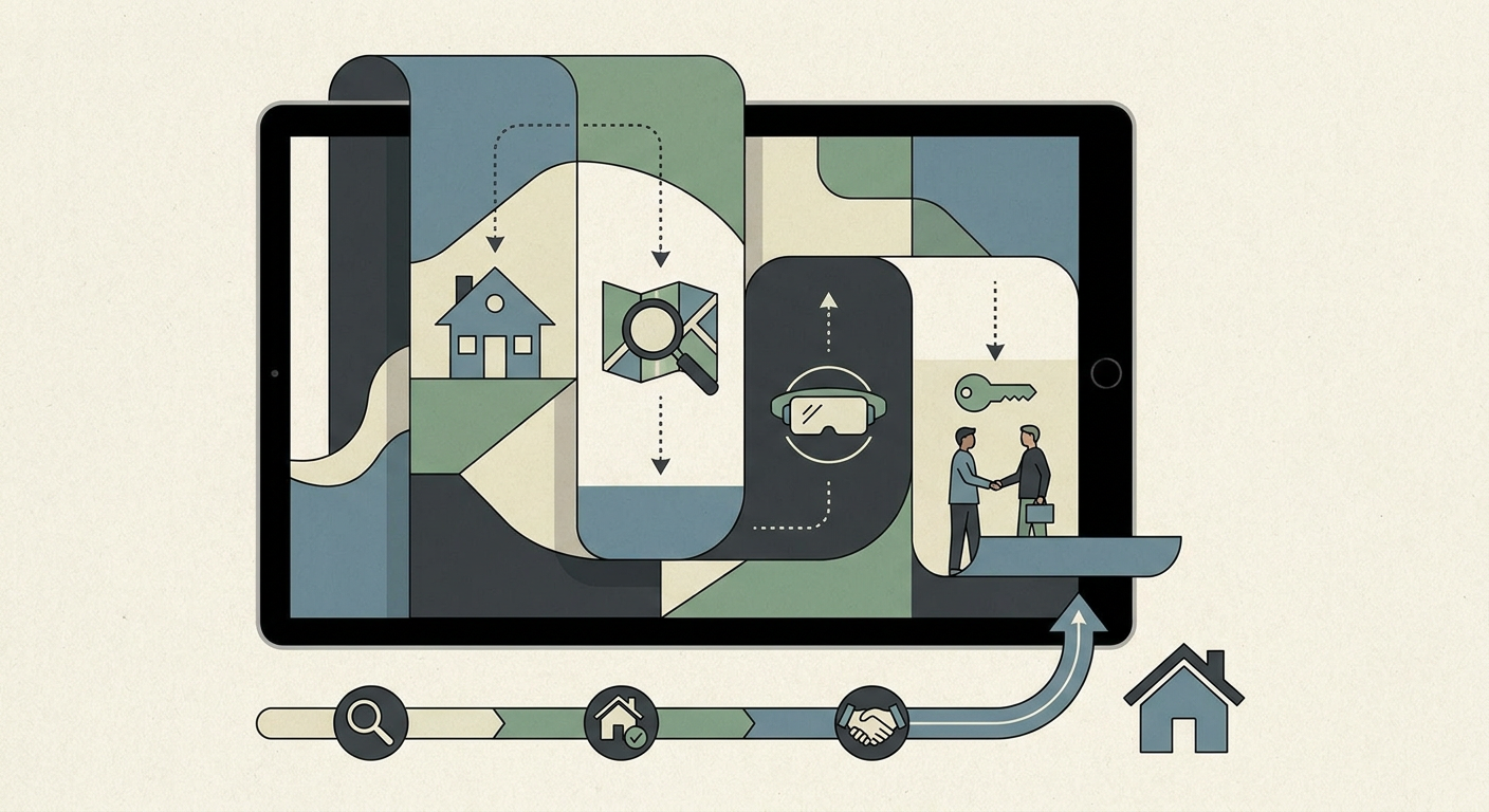
A well-structured scrolly experience might move through:
- project promise
- location and destination context
- architecture and design story
- lifestyle or amenity logic
- product detail
- CTA and next step
This creates continuity and helps the website feel more like a guided experience.
Why narrative UX helps buyers understand a project
Many developments are conceptually rich but digitally hard to absorb. A buyer may struggle to see how architecture, place, amenities, and product fit together. Narrative UX helps connect those pieces.
It does that by:
- controlling information sequence
- reducing the feeling of overload
- building a stronger emotional rhythm
- making transitions between ideas clearer
Instead of forcing the user to assemble meaning themselves, the site helps reveal the logic in the order that makes most sense.
Where scrolly-telling works best
Scrolly-telling is especially useful when the project has enough story to justify a more immersive structure.
That often includes:
- premium residential launches
- branded residences
- destination-led or waterfront projects
- architecture-forward developments
- projects where atmosphere and positioning matter as much as raw inventory
For simpler launches, a strong traditional structure may still be enough. Narrative UX works best when it adds real clarity rather than only visual novelty.

What makes a scrolly experience effective
Clear story logic
The sections should follow a meaningful sequence. The user should feel guided, not trapped in visual experimentation.
Strong transitions
Each section should connect naturally to the next so the project unfolds coherently.
Useful content in every scene
Scrolly-telling fails when it prioritizes motion over meaning. Each section still needs to explain something important.
Mobile awareness
Narrative UX must still perform well on smaller screens. If the mobile experience becomes awkward, the structure weakens.
Scrolly-telling is not only about animation
A common mistake is to equate scrolly-telling with motion effects. In reality, motion is only one part of it.
The stronger advantage often comes from:
- pacing
- sequencing
- visual emphasis
- immersive context-building
- progressive disclosure of information
In other words, narrative UX is more about editorial control than animation itself.
How it supports conversion
Narrative sites can improve conversion when they make the project feel easier to understand and more emotionally coherent.
That helps because:
- the user reaches the CTA with more confidence
- the project feels more memorable
- brand perception becomes stronger
- product and lifestyle logic feel integrated
This is especially valuable for projects where simple listing-style UX would undersell the real value proposition.
Common mistakes developers should avoid
Making the site beautiful but slow
Narrative UX should never come at the expense of performance.
Using motion without strategy
If the page moves impressively but says little, it will not support commercial outcomes.
Overcomplicating navigation
The user should still feel oriented even inside a more immersive flow.
Forgetting the CTA path
A strong narrative still needs a clear action step at the right moment.
How this looks in practice
Public references such as Quatrimmo Vision show why narrative structure matters. The experience feels more deliberate because the project is introduced in layers rather than dumped into a generic page structure.
That is the real lesson. The power of scrolly-telling is not that it looks modern. It is that it helps a richer project story become easier to follow.
FAQ
What is scrolly-telling in a real estate website?
It is a narrative web structure where the project unfolds section by section as the user scrolls, creating a more immersive and guided experience.
Does it improve conversion?
It can, especially when the project benefits from stronger storytelling and when the flow makes the offer easier to understand.
Is it right for every developer project?
No. It works best when the project has enough story, positioning, or atmosphere to justify a narrative structure.
How can MARKETIKA help?
MARKETIKA can decide whether narrative UX is strategically useful, then connect storytelling, web structure, visuals, and conversion logic into one coherent project experience.
Final takeaway
Scrolly-telling for real estate helps buyers understand a project because it introduces the right information in the right order. For developers, that means the website can behave less like a static container and more like an intentional guided journey.
When narrative UX is handled well, buyers do not just see more. They understand more.


