


Scrollytelling works in real estate because it mirrors how buyers want to discover a project: visually, progressively, and with a sense of narrative.
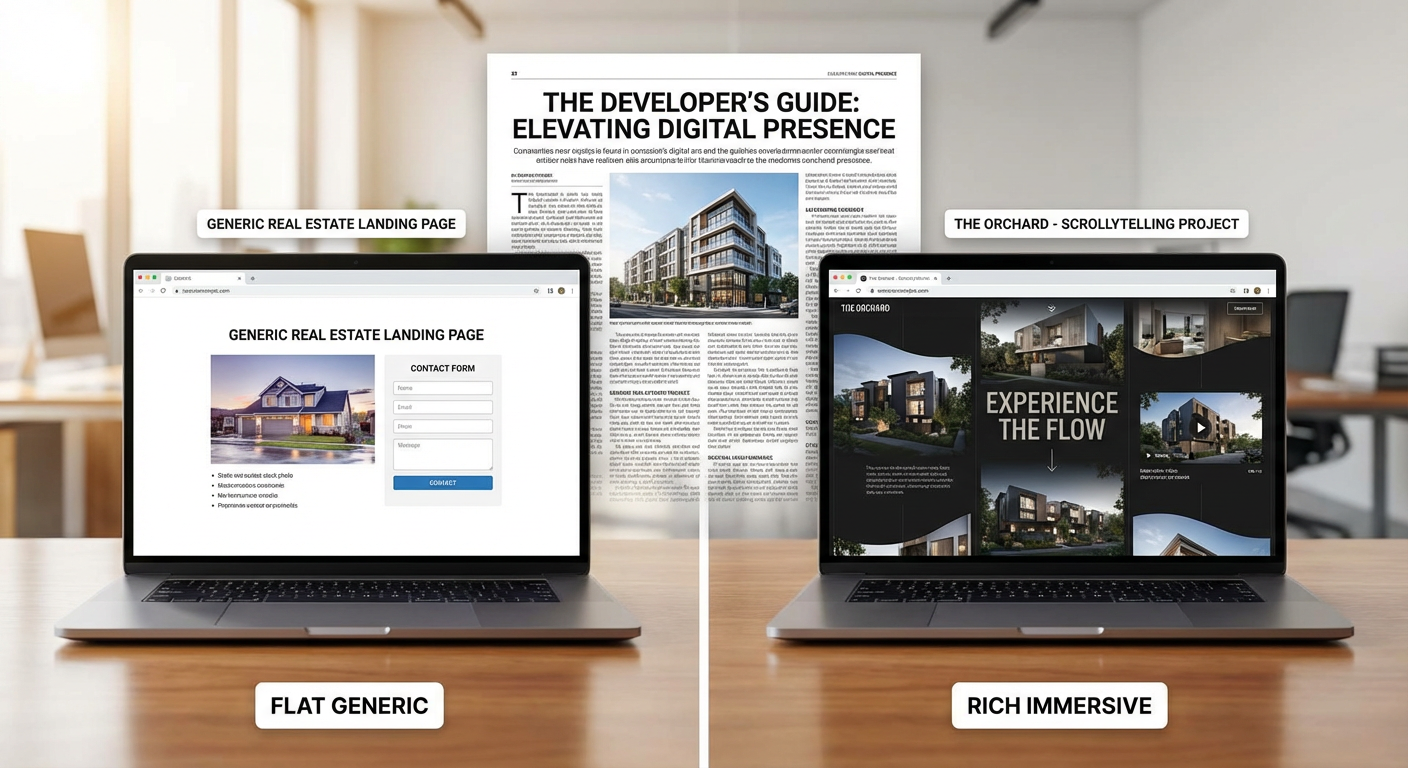
Traditional landing pages often present information as a flat stack. Headline, gallery, bullet points, form. That can work for simple offers, but it often underperforms for premium developments, off-plan launches, and projects where the emotional story matters as much as the practical details.
A scrollytelling website gives developers a different advantage. It controls pacing. It reveals the right information at the right moment. It can move the user from atmosphere to product clarity to action without making the journey feel mechanical.
That matters in a category where online discovery shapes early perception. Buyers increasingly expect digital experiences that are not only clear, but also engaging and consistent. Source: Adobe digital trends report.
Why scrollytelling fits real estate so well
It lets the project unfold like a story
Most strong developments are not just products. They are narratives about place, design, lifestyle, investment logic, or status.
Scrollytelling helps reveal those layers in sequence instead of forcing buyers to piece them together on their own.
It creates stronger emotional momentum
When movement, transitions, imagery, and copy are aligned, the page feels more immersive. That can create a stronger first impression than a standard landing-page template.
It makes complex projects easier to explain
Masterplans, branded residences, mixed-use communities, and design-led projects often need more than a short benefits list. A narrative web structure helps simplify complexity without oversimplifying the offer.
What good scrollytelling actually looks like
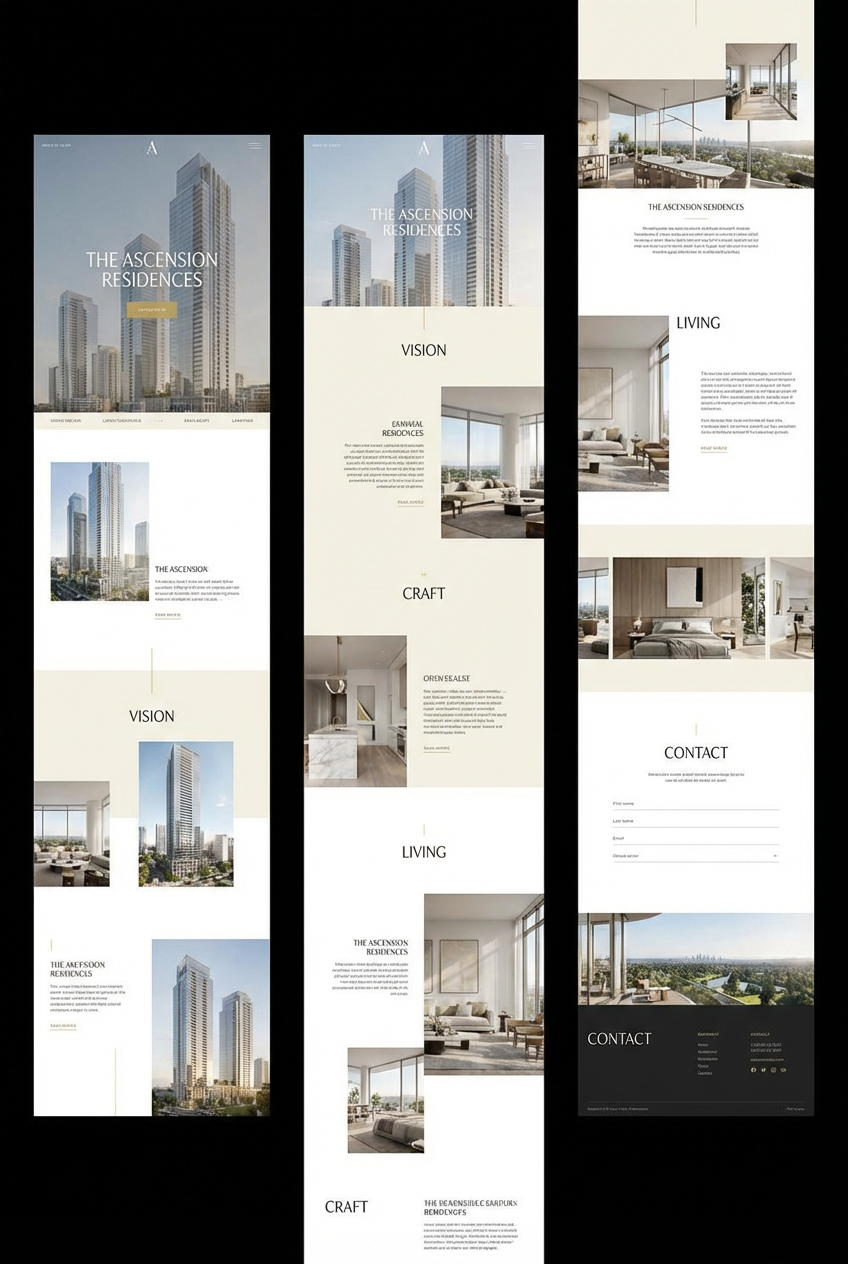
Scrollytelling is not just animation. It is choreography.
A strong sequence often includes:
- A clear opening idea
- A premium visual anchor
- Progressive reveal of location and project logic
- Product explanation with enough specificity
- Amenity or lifestyle sections that deepen desire
- A conversion moment that feels earned
The best examples feel smooth and intentional. The weak ones feel slow, distracting, or self-indulgent.
Where traditional landing pages still win
It is important to be honest here. Scrollytelling is not automatically better for every situation.
Traditional pages can outperform when:
- The offer is simple and urgent
- Traffic is extremely bottom-of-funnel
- Mobile speed is the top priority
- The audience already understands the project well
That is the trade-off. A simpler page is often faster and more direct. A scrollytelling page is often more persuasive for premium or story-led launches but requires stronger strategy and execution. For most developer brands, I would recommend scrollytelling when the project needs emotional buildup and product explanation, not just lead capture.
Why many scrollytelling pages fail
They prioritize motion over message
If the animation is memorable but the positioning is weak, the page still underperforms.
They become too heavy on mobile
Real estate traffic is often mobile-first. If the experience feels slow or awkward, the story collapses.
They forget conversion logic
A beautiful scroll journey still needs clear paths to request pricing, book a presentation, or speak with a sales advisor.
They lack a strategic visual system
Scrollytelling amplifies both strengths and weaknesses. If the CGI, typography, hierarchy, and copy are inconsistent, the final result feels messy rather than premium.
When developers should choose scrollytelling
Scrollytelling works especially well for:
- Off-plan launches
- Premium branded residences
- Design-forward architecture
- Destination-led communities
- Projects that need to educate and inspire at the same time
This is where MARKETIKA’s project websites and interactive digital portfolio is helpful as a reference point. The strongest projects combine storytelling, web design, and sales logic instead of treating them as separate workstreams.
How to build a scrollytelling page that performs
- Start with a sharp positioning idea.
- Map the emotional and informational sequence before designing.
- Keep the motion purposeful and restrained.
- Optimize heavily for mobile performance.
- Make CTAs feel natural throughout the journey.
- Connect every interaction to a measurable conversion framework.
For developers building premium brand ecosystems, Marketika’s expertise across web, branding, and visualization is especially relevant because scrollytelling only works when all three layers reinforce one another.
Final takeaway
Scrollytelling websites outperform traditional real estate landing pages when the project needs a stronger sense of atmosphere, explanation, and emotional momentum.
They are not a shortcut. They are a more strategic format. When done well, they help buyers understand not just what the project is, but why it matters.


